I have been seeing a lot of articles lately about high dynamic range (HDR) photography. I’ve always been fascinated by it. I read through a couple of blog entries and decided that I should try it myself. In the past I have said that I couldn’t do things like HDR due to the limitations of me only having a point and shoot camera. However, I have since learned that there is a lot that I can do with my camera it just takes a lot of practice, patience and a good eye. I went out and I took some photos and I wanted to make an entry about how I took the photos as well as show you how I got the final image.
The images above are as follows. The first image is a photo of the scene taken at normal exposure. The second image is a composited image created from 3 images at different exposures. The last image is after adjustments have been made to the composited image to make it look more like what I saw while I was taking the photo. If you click on the photos you can see a larger version of each in a light box.
Selecting a scene
The first thing you’ll want to do is to select something to take a photograph of, duh! Taking photos using the HDR process is a little bit more time consuming. I’ve noticed that since I have been using this process I’ve taken photos of fewer scenes. This also means that I have taken better photographs because I’m thinking about what would look best in the final output image.
Choose a scene that is not going to change for about 2-5 minutes. This time of course depends on how fast you can change the exposure of your camera to take the next photo. Some point & shoot cameras and dSLR cameras give you the ability to take photos at multiple exposures at the same time. If you have this feature you’ll definitely want to take advantage of it so you can take photos of objects that aren’t completely still. In the example below you’ll see an HDR image of the top of a tree. You’ll notice there is quite a bit of blur. Silly me wasn’t thinking about the tree moving whenever I took the photo. I think the photo is interesting but not of the highest quality.
Shoot something that you have shot in the past but it didn’t turn out the way you had hoped. Look for shadows and anything that will have detail in the final image. Taking the photos at multiple exposure values will allow many of the details that you see with your eyes to come out in the final image. I like to look for shadows cast onto the ground, rolling hills or a gorgeous blue sky.
Shooting the scene at multiple exposures
Although my camera has a manual mode I have been taking my shots using “Program auto shooting” which on other cameras is called “Aperture priority.” Using this setting the camera gives me more options for adjusting the focus and fine tuning the capture options. Once in Program auto shooting I set up the scene: zoom, white balance, ISO, etc. I would highly recommend taking your photos in this mode or a similar mode on your camera since you have more control over the photos. Don’t use the auto mode, your photos will never turn out all that great in my opinion.
Look for a setting that allows you to change the exposure compensation. On my camera it is in the menu options and is called “EV.” Most cameras allow you to go all the way up to +2.0 and down to -2.0. In the several photos that I have taken and used the HDR technique I have found taking shots at 0EV, +1EV and -1EV is plenty. The more images you take the more likely the images will be blurred due to something in the scene moving. If you want to take your photos by adjusting the shutter speed have a look at this tutorial.
Some cameras (even point and shoot) have a setting that will allow you to take multiple photos at different exposures at the same time. If you are lucky enough to have this on your camera take advantage of it.
As you are taking a photo of each scene you might want to make a new folder on your memory card for each scene. This will allow you to organize your scenes a little better and keep the multiple exposures of the scene in the same folder. If you take multiple sets of photos of the same scene this really helps.
Always shoot with a tripod. If you don’t have a tripod you’ll definitely want to get one. It is crucial. When you are shooting the photos at multiple exposures you’ll want to take a photo of exactly the same thing. During the compositing process the photos will be merged, any slight movement will show a blur. Along with using a tripod you’ll also want to use an auto timer of a few seconds to minimize camera shake.
Combining the images
Once you have got the images off of your camera you’ll need to combine them. I am using FDR Tools Basic on Windows which is also available for Mac OS X 10.3.9 or later.. I am using the basic free version which seems to do really well. Another freeware tool for Windows is HDRShop or Qtpfsgui. Qtpfsgui also works with Linux or the Mac. If you have Adobe Photoshop you can use the “Merge to HDR” function.
To edit the final output image you’ll need an image editing tool. If you have Photoshop definitely take advantage of it as you’ll be able to work with more than 8 bits which will give you a better output image. Although the GIMP only offers 8 bits I’ve been using it to edit the final output image and getting decent results. If you don’t have Photoshop I would highly recommend The GIMP, since it’s free and works on Mac (using X11), Windows and Linux. You could also use CinePaint which is capable of handling 8, 16 and 32 bit images.
Open up FDRTools Basic, click on Images >> Open, navigate to your set of 3 images, highlight them and click on Open. FDRTools will then begin to put the images together. Once the images are combined you can tone map the image (tone mapping button at the top) but I’d recommend simply saving the image out as a JPEG and editing the final image in The GIMP, Photoshop, CinePaint or another program of your choice.
Adjusting the composited image
Before you start editing the image that you saved out of FDRTools make a copy of it somewhere. On my computer I keep a folder for “Originals” and another folder for “Edited” photos. If you make a mistake or later decide you don’t like the adjustments you have made you can change them later. If you’re using Aperture, Lightroom, Picasa or another non-destructive editing program you won’t have to worry about this unless you are just a fussy person like myself who likes keeping things tidy!
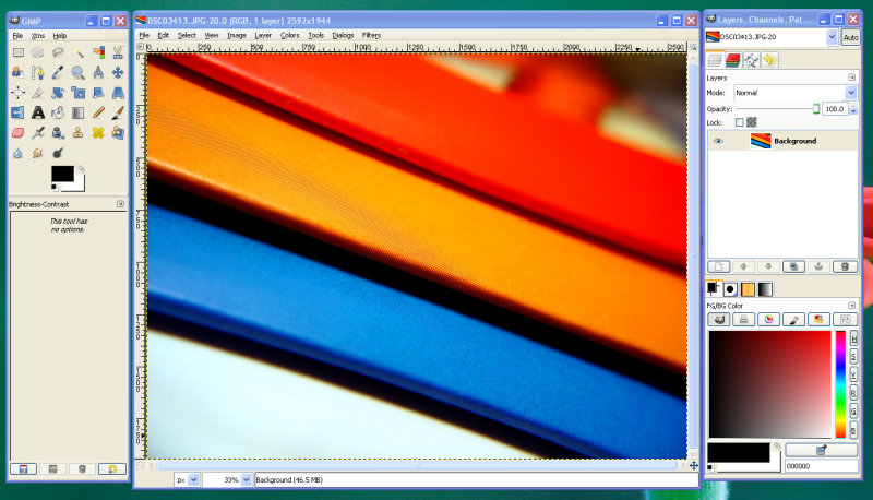
When you open the image in The GIMP it will ask you if you want to convert the image to the RGB working space. You should always work with your photos in the RGB color space so I always have the image converted from whatever embedded format the photo has.
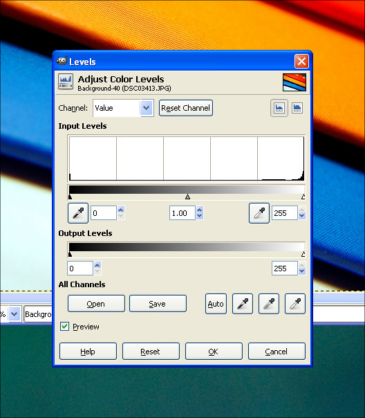
Once the image has been converted and opened the first thing I do is go to Colors >> Levels. Under “Input Levels” I move the sliders around until I get something that I like. You may have to add contrast or adjust the white balance but usually just moving the input level sliders around will give me a great result.
Another quick way of getting the colors right is by adjusting the white balance. In the Levels dialog box select the “white” dropper and choose a white spot on the photo. Then choose the “black” dropper and choose a completely black spot on the photo. This is usually better than adjusting the levels with the input levels slider but sometimes it’s very hard to find a white spot on a photo.
Once you have adjusted the image to your liking simply save the photo and share it! There are many groups for HDR photography on Flickr that you could join and post your images to and get tips on them for the next time.
I recorded a video tutorial for this post which you can download a high resolution version of using the link below. If you prefer to stream the video tutorial use the Vimeo player at the bottom of this post.
For a while now I have been using the trial version of Adobe Photoshop Lightroom. The trial expired and it’s still a bit too much for me to pay for. I love Picasa but it doesn’t have all the features that Lightroom spoiled me with while I was using it. Fortunately, there is The GIMP (Gnu Image Manipulation Program). It’s free which is the part that matters to most people. It’s got a ton of features and is comparable to Adobe Photoshop in many aspects. I’ve been using The GIMP on and off again since 2003. I have always wanted to switch to it because I love free and open source software. Unfortunately, I’ve never been able to completely switch because I haven’t taken the time to sit down and learn it. Fortunately, with the latest version of The GIMP I am able to say that it can become my primary photo enhancement/editing tool. One of these days I hope it will become my tool for creating web graphics, but that’s another post for another day.
Although I am not very fluent with the GIMP for creating web graphics I have been using it for the past couple of weeks to enhance my photos before I upload them to Flickr. I don’t know how to do really cool effects, yet. Those will take time. But for the most part whenever I pull images off of my camera I really only need to do a few things like: increase saturation of individual colors, white balance correction, brightness/contrast and sharpening. Picasa from Google will do most of those but it doesn’t really allow you to fine tune color saturation like I was spoiled with while using Lightroom. Now, some people may think that it’s wrong to increase the saturation of colors in a photo but in my opinion I am going to make the photo look exactly like I remember it.
White Balance
Whenever I first open a photo to enhance the first thing that I do is use the auto white balance tool (Colors >> Auto >> White Balance). It’s a very quick and simply way of ensuring that your whites are whites. It’s like bleach for your photos. The great thing about this bleach is it’s color-safe, too! Ok. Seriously though it really does help, for the most part. A lot of times I will take a photo of an object, like a flower, on a white piece of paper with two desk lamps hovering above it. The two desk lamps have regular incandescent light bulbs in them and they generally produce a yellow cast in my images. Using the auto white balance the yellow cast is usually removed quickly and effortlessly.
If the auto white balance tool doesn’t work to your liking (which it sometimes won’t, count on it) another way to get the white balance correct in an image is to use the levels tool (Colors >> Levels). When the dialog box opens you can use the eye dropper tool on the far left to choose a spot on your photo that is completely black. Using the eye dropper tool on the far right you will choose a spot that is completely white. I have generally found that if there isn’t a completely white point in my photo choosing only the black spot works pretty well for correcting white balance. The same goes if there isn’t a black point in my photo, simply choose a white point. Also using this tool you can choose a gray point in your photo using the middle eye dropper under “All Channels.”
Color Enhancement
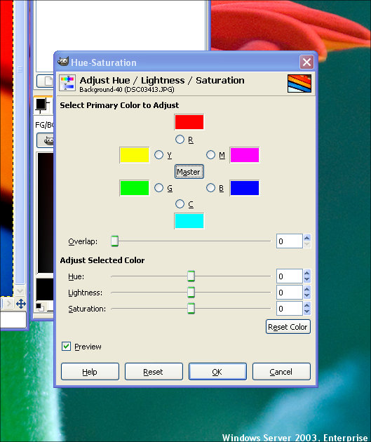
A lot of times when I pull images off of my camera and get to looking at them I think the colors are a little duller than what I remember the object I took the photo of being. In actuality it may not have been but what I remember isn’t what I’m seeing so I want to correct these. By going to Colors >> Hue-Saturation you can improve what you see by adjusting the hue of the color, the lightness and the saturation of the primary colors (red, yellow, green, cyan, blue and magenta). The lightness setting is really useful if you have a photo that came out dark and you have a photo where you really only wanted that color to stand out anyways. Increase it’s lightness value and optionally it’s hue and saturation and it will really stand out.
I will caution you on one thing. Don’t use too much saturation. One obvious reason is that your image will wind up looking fake (leaves are generally not neon green!). Also, if you increase the blue too much you’ll notice it really quickly because you will start seeing spots in other parts of your photo where you didn’t even know there was blue. The same holds true for any color. Just be realistic with this tool. In my opinion as long as it looks good and is believable then it’s okay, unless of course you want neon pink grass!
Brightness/Contrast
Before I talk about contrast I want to say something quickly about brightness. I don’t use the brightness tool of image editing applications a whole lot. I do, just not often. I only use it in extreme cases. I find that when I use the brightness tool that my images become too grainy to be accepted by my extremely critical eyes. Also whenever I use the brightness tool I find myself quickly adding more contrast to a photo. I try to avoid the brightness tool. You however may have different opinions on this so experiment with it.
Using the contrast tool (Colors >> Brightness-Contrast) is something that I am very fond of. Adding contrast to an images is one of the quickest and easiest ways to enhance your photos. Adding contrast to a photo deepens the dark colors of an image while still allowing the bright colors to shine through more brilliantly. Let’s take a photo of a flower as an example. The flower petals are bright and beautiful but there is a slight problem, they aren’t as brilliant as we remember them. Adding just a little bit of contrast will help increase the beauty of the photo immediately.
Again, this is something to use in moderation. Using The GIMP I generally start out with 5, 10 and 15 but try my best to stay under 15 if it’s at all possible. Play around with it though and see what it does. See what works best for you!
Converting Color to Black and White
When my parents were growing up the only option for photography was black and white. Now the default is color and you have to either buy black and white film or change your camera’s setting to black and white. I normally tend to only shoot in color and adjust the colors after I have taken the images off of my camera. That way I can decide whether I want the image to be in color, black and white, infrared, cyan or any other number of wacky color combinations.
There are many different ways to change a color image to black and white using The GIMP. The quickest and easiest way is to click on Image >> Mode >> Grayscale. You can also click on Colors >> Hue-Saturation, making sure that “Master” in the center is selected and move the Saturation slider all the way to the left or enter a value of -100.
Image Sharpening
Sometimes we are not able to capture an image as sharply as we remember. Fortunately for us sharpening is a standard feature in image editing applications today. It’s a bit harder to find in The GIMP than you’d expect but it’s located at Filters >> Enhance >> Sharpen. In that same area there is another tool called Unsharp Mask that you might enjoy playing with. I won’t go into detail about sharpening images because that’s pretty straight-forward. There are plenty of techniques you can use in The GIMP to sharpen an image, one in particular I am wanting to try out soon is called “Smart” Sharpening.
Image Cropping/Rotation
Another simple alteration that you’ll probably want to make on some of your photos is to crop them. Crop someone out or crop just the important part of a picture. Select the rectangle select tool from the tools dock (on the left by default), draw a selection of what you’d like to crop and adjust it to your liking and click on Image >> Crop to Selection and there you have a cropped image. Remember to not crop your images too much or when you print them you won’t have enough of an image to stretch out across the paper and the image will be blurry or pixelated.
Along with cropping an image you’ll probably occasionally have to rotate a few of them. That’s very simple as well. Go to Image >> Transform and choose which direction you would like to rotate your image.
Final Thoughts
I realize that this tutorial is fairly basic. I wanted to write it because when someone new to photo editing opens a program like The GIMP they are blown away by all the features and options that it offers. My hope is to give you a few tips that you can use to jump into The GIMP and start editing your photos. I think once you do jump into the program you’ll start to learn more about it. You’ll find many other tutorials online and like I said, I’m still learning it as well so when I learn something new I will be writing a new tutorial!
One other thing I would like to suggest is to make sure you follow my advice for backing up your digital media collection. What I have been doing is pulling photos off of my camera, copying the ones I like and want to edit into another folder. If I edit them there and save them and later decide I don’t like the change that I made I can go back and retrieve the original photo and adjust the photo again.
When you do save an image, make absolute certain you are saving the image at the highest quality possible. The GIMP defaults to something in the 90-98 quality range. If you’re uploading your photos to Flickr or going to print these photos, increase the slider to 100% and save it as the default. Also, make sure that you go to the advanced options to make sure the “Save EXIF data” option is checkmarked. This is one really great thing about digital photos if you can get the exposure, time/date, frame, camera model, etc from the data saved in the file. Make sure this data is retained!
Last month (May 2007) I wrote a blog entry about Aperture. At the time I was house sitting for my sister who had just got a new iMac. When I came home I was disappointed that I didn’t have a similar application to use for working on my photos. Last fall I had played with the Adobe Lightroom Beta and it was extremely slow on my computer so I didn’t really give it much thought. Then I decided to download the trial and give it a shot anyways after thinking that it might actually perform better now that I have a dedicated graphics card with 128MB of memory instead of the motherboard’s integrated GPU which only had 32 MB of RAM allocated to it. The following will be my thoughts of Lightroom and I will be comparing a lot of it’s features with the experience I had with Apple’s Aperture.
Features I Really Liked
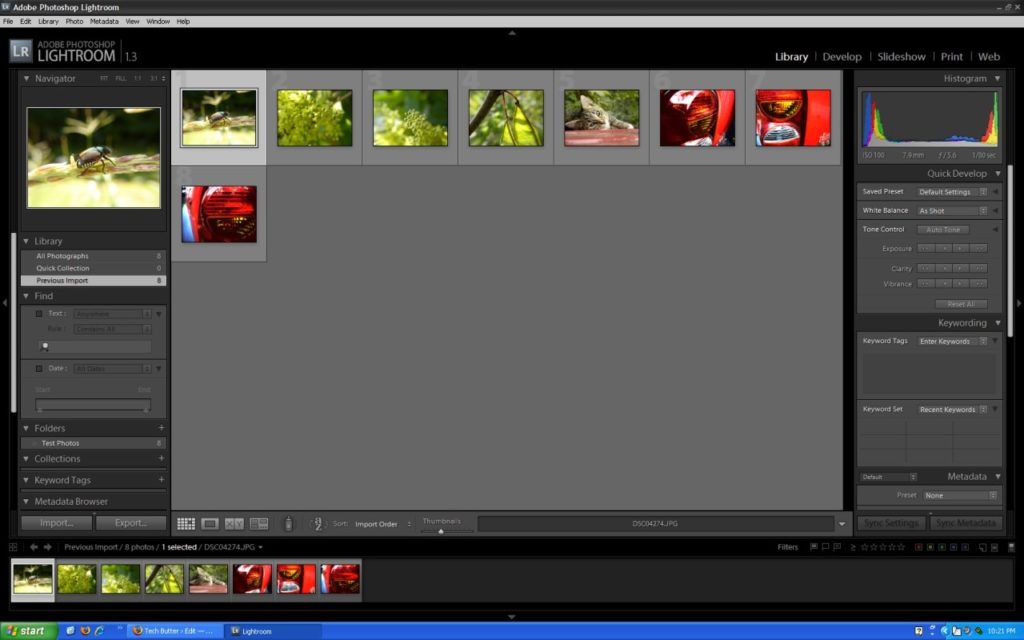
When you first open Adobe Photoshop Lightroom you are asked where you want to import images from. You can choose to import images from your camera or from a location on your computer. Once you choose and your images have been imported they are placed into the Library. You’ll also probably want to change the view from “Loupe View” to “Grid View.” This will allow you to see all of the images that you just imported. Also, it’s easier to go ahead and rotate your images from this view before you get to adjusting the images. Once you do get your images rotated and you are ready to start adjusting them, click on an image that you want to work on and then click on Develop, this is where all the adjustments will take place.
When you’re in the “Develop” mode there are a lot of adjustments that you can make. The first adjustment that I usually make is the white balance, exposure and contrast. Lightroom has a few pre-programmed presets for adjusting tone curve and this is what I usually use because they seem to work pretty well for me. If you find yourself applying the same adjustments to more than one or two images you can create additional presets.
The next adjustments that I make are of the colors. This is my favorite feature and one that really makes Aperture and Lightroom worth their pricetags. My camera doesn’t do a great job of applying saturation to images, which is acceptable in some instances because the camera might apply too much and it would be hard to correct in post processing. I usually find myself increasing the saturation of blues to make skies bluer and greens to make leaves much more vibrant. If the color you see is a bit odd from what you remember seeing you can change it’s hue and luminance.
I want to talk a little bit more about the lighting adjustments that you can make using Lightroom. You can use the tone curve tool or you can use sliders to adjust the lightness or darkness of highlights, dark areas, light areas and shadows. You’d be surprised by just how much better you can make an image look by slightly tweaking the tone curve.
An adjustment that I find myself needing quite frequently is a sharpening tool. Lightroom’s got one and you don’t have to add it to the panels every time you open a new image like I did in Aperture but, I have never seen any difference when I have used this tool. I don’t know whether it’s so subtle I just don’t see a change or if my monitor just isn’t all that great. What I’ve been doing is when I’m finished with the photo I export it out and sharpen it up in an external editor.
When you have finished editing the photo and are satisfied with it you can add a star to it. You can add 1-5 stars to each image. I usually apply a 5 star rating to images that I’m going to export and upload to Flickr. There is also a feature that let’s you add images to a “Quick Collection.”
If you’ve got multiple images of the same thing and you need to compare them Lightroom has you covered there as well. The only downside to Lightroom’s comparison feature is that you can only compare one photo at a time.
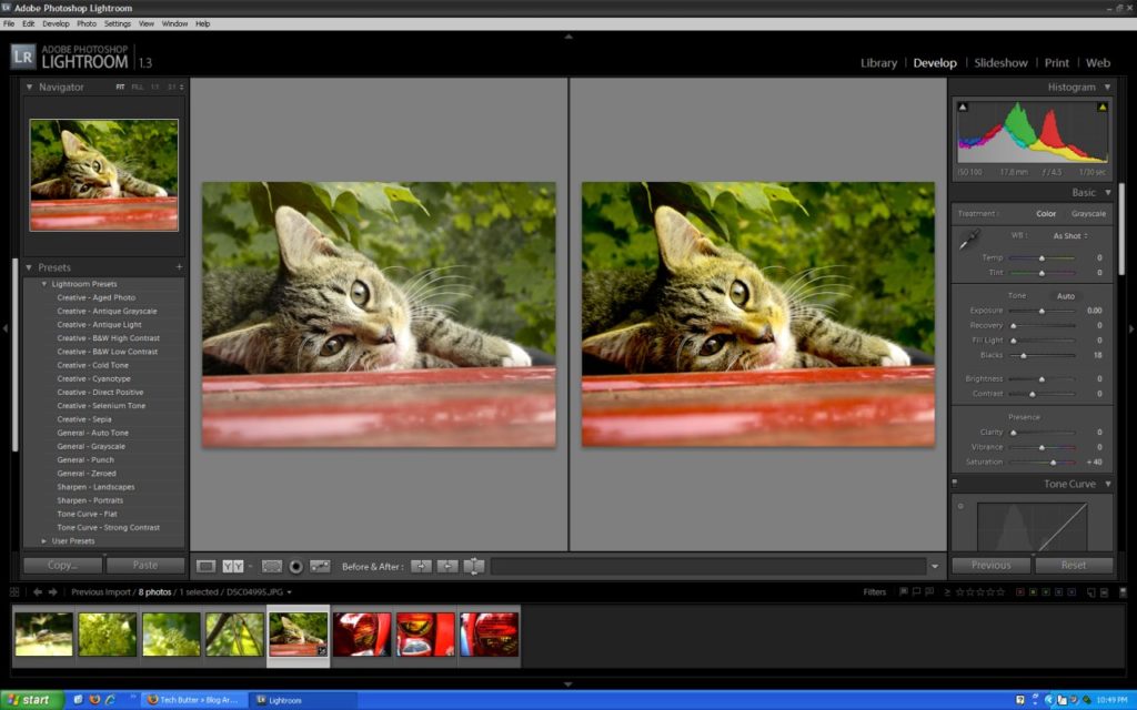
In addition to the comparison tool Lightroom has a tool that I really like called “Before & After.” I really like to use this to see just how much better my images are once I’ve adjusted the lighting, saturation, etc.
Another great feature of Lightroom that most good photo editing applications are incorporating these days is non-destructive edits. Like I mentioned in the Aperture review, it is really nice to be able to make changes to images and a year later come back and still have the original images. You’ll want to make backups of course, which is built into Lightroom, but, every good photo editing application will have this.
I am happy to say that cropping images in Lightroom is much easier than it was in Aperture. At least the figuring out how to do it part. When I was using Aperture it took me a while to figure out how to crop an image, in Lightroom it was much easier to understand. What I really liked about Lightroom is that when I cropped an image and made changes to the image, if I zeroed the image out the crop would stay. I thought that was really nice.
What I Was Not So Happy With
Lightroom is resource intensive. I know I don’t have the most powerful computer on the planet, but still, it’s resource intensive. I couldn’t use the application if my computer’s display was running at 1280×1024, I’d have to decrease to 1024×768. I had to close out of all other applications that I was running. Even running Skype and Lightroom at the same time would cause my computer to lockup. Even with closing all applications Lightroom still isn’t very fast, sliders occasionally become unresponsive and images take their precious time loading. You really need a modern computer to use Lightroom effectively, something faster than my AMD Athlon XP 1700+, 128 MB GPU and 1 GB of RAM.
Features I Would Like To See
If you need to see what your image looked like before you applied an adjustment you can use the history panel. In my opinion it’s not as nice as Aperture’s ability to hide an effect by clicking on a hide icon beside of the adjustment.
Another feature that I really miss from Aperture is full screen editing. You can hide panels very easily in Lightroom, too easily sometimes, but it doesn’t compare to being able to edit an image in full screen mode. I really miss that and hope to see it in Lightroom soon.
Like I mentioned previously, in my opinion the sharpening tool does not do anything for images. I’d like to see this corrected. Also, I’d like to see some sort of tool to go along with the sharpening tool so you can further define where you want to apply the sharpening to.
Final Thoughts
Although Lightroom is missing a lot of things that I really liked when I was using Aperture, I think Lightroom is a great piece of software. It’s only at Version 1.0 at the moment so I’m sure better things are to come. If you’re needing photo editing software and you’re on Windows, I would highly recommend Adobe Photoshop Lightroom. If you’re using a Mac, I’d recommend sticking with Aperture. Both Lightroom and Aperture are $299, which in my opinion is a bit steep. However, it is cheaper than buying a copy of Adobe Photoshop and both applications are much easier to work with than trying to learn how to edit your photos in Photoshop.